The following point may seem obvious: Korean letters don't appear the same in each font. For some reason though, this confuses clients from time to time.
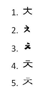
Here's the Korean letter chi'ut written in five different fonts:

Notice how the line/dot at the top in #3, #4 and #5 is disconnected from the rest of the letter, whereas, in 1 and 2, it's connected. Do you see that the bottom-right line in #2 and #3 comes up and connects midway to the line that runs from the bottom left? But in #1, #4 and #5, this line goes all the way up to the base of the long horizontal line. And in #2 and #3, the line from the bottom left connects to the horizontal line on the right side, even though in the other examples it connects in the middle.
Regardless of these differences, it's the same character in all five fonts.
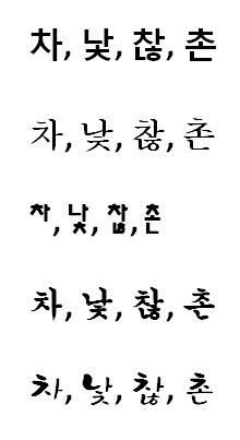
Not only this, individual letters look different depending on where they are positioned in a character. Here are more examples showing the Korean letter chi'ut in various fonts and in different spots within characters.

In English, we don't face the issue of letter differences based on position within a character, but we do have plenty of variation between fonts. Take the letter "a" for example. It's usually rendered much differently when handwritten than when typed. But of course, it's still the same letter in both cases.
Korean Translation Tip – If you're really curious about why a Korean character looks different in a translation from your translation provider than it does in some other document you have on-hand (such as a hand-written or printed example used on a previous job), feel free to ask about it. But don't be surprised if you hear back from your translator that it's just a minor font difference.


